Overview
Envision a Comprehensive Indoor Navigation Solution
At Mapxus, we aimed to create a complete navigation experience for users in complex indoor spaces. As the product grew, new features and requirements were introduced by clients, the sales team, and directors, which were sometimes unclear and confusing. My role was to translate these ideas into user-friendly solutions by working with cross-functional teams and continuously iterating the design.
The success of the company was driven by the launch of several products, including a SaaS map data management platform, kiosks, mobile navigation apps, internal testing apps, and web apps. These solutions have been adopted by 10+ clients in industries such as airports, shopping malls, and hospitals.
Target Users
Emma | Aged 30 | Tourist
Background: Enjoys explore popular shopping malls and museums but often feels overwhelmed in large indoor spaces. Frequently uses map and acquiring information on the phone
Challenge: Get lost easily in complex indoor environments, especially when signage is unclear
Goals: To explore new places confidently and make the most of her time on finding points of interest
Needs: A user-friendly map that offers clear directions and detailed information about points of interest
Iterative Process
1. Understand Requirement
When new feature ideas came up, I worked closely with directors, product managers and other stakeholders to figure out the use cases and goals of the features. We brainstormed, created user stories, and defined the possible scope of an early-stage work.
2. Rapid Prototyping
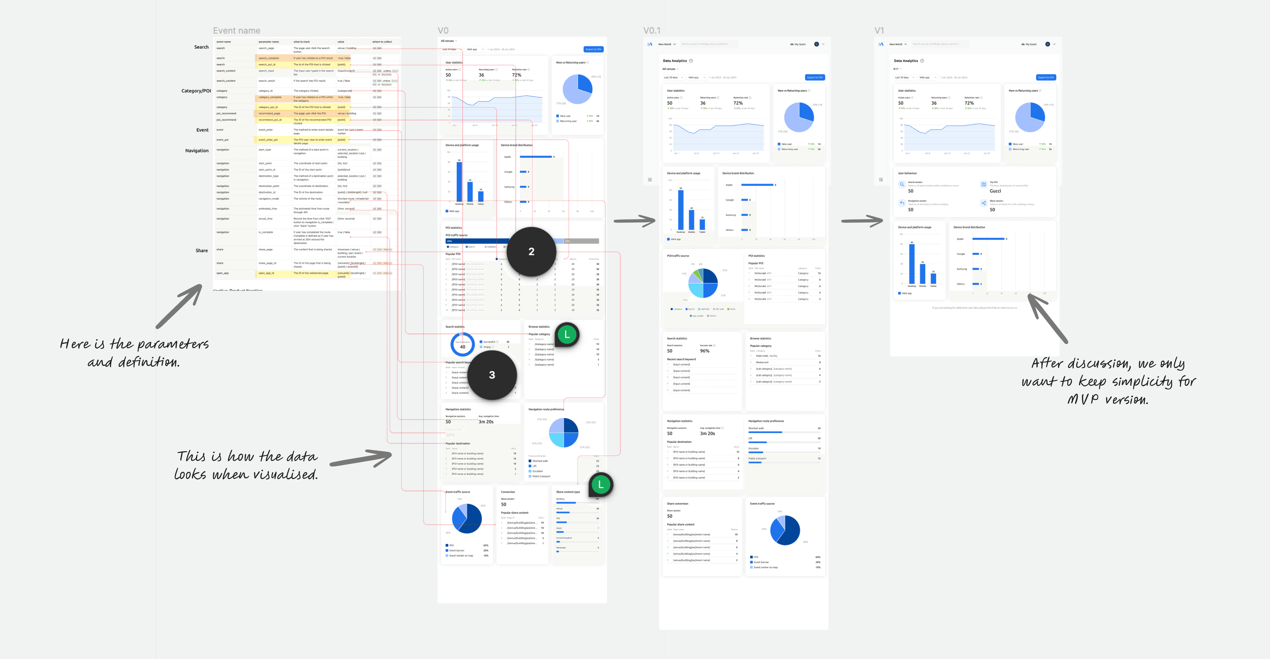
After that, I quickly explored the solutions and turned ideas into wireframe and mockups for gathering feedback. For example, when designing a data analytics dashboard, we made several versions to figure out what type of map data was most important for venue owners and how it should be displayed. The sales team and regional partners also gave us insights on the client perspective.

3. Iteration and Feedback
We moved forward to the implementation when we balanced the user needs, business goals and technical constraints. We rolled out early versions of the product within a week to collect feedback quickly. This allowed us to keep improving the design and make adjustments based on stakeholder input.
Interestingly, creating mockups and prototypes make everyone much easier to communicate ideas and clarify what we're aiming for.
Final Design
In the following, I'd like to share a few key projects that I've completed along the product iteration journey.
1. Onboarding experience
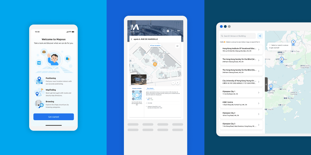
In this task, we aimed to effectively introduce new users to the app and its navigation features. So I designed a responsive onboarding flow for new users, introducing the map's navigation and positioning features. I used Figma and Lottie for animated elements. I also had a few rounds of discussion with the developers to ensure the animated file format is adaptable on multiple platforms.


2. Cross-platform experience
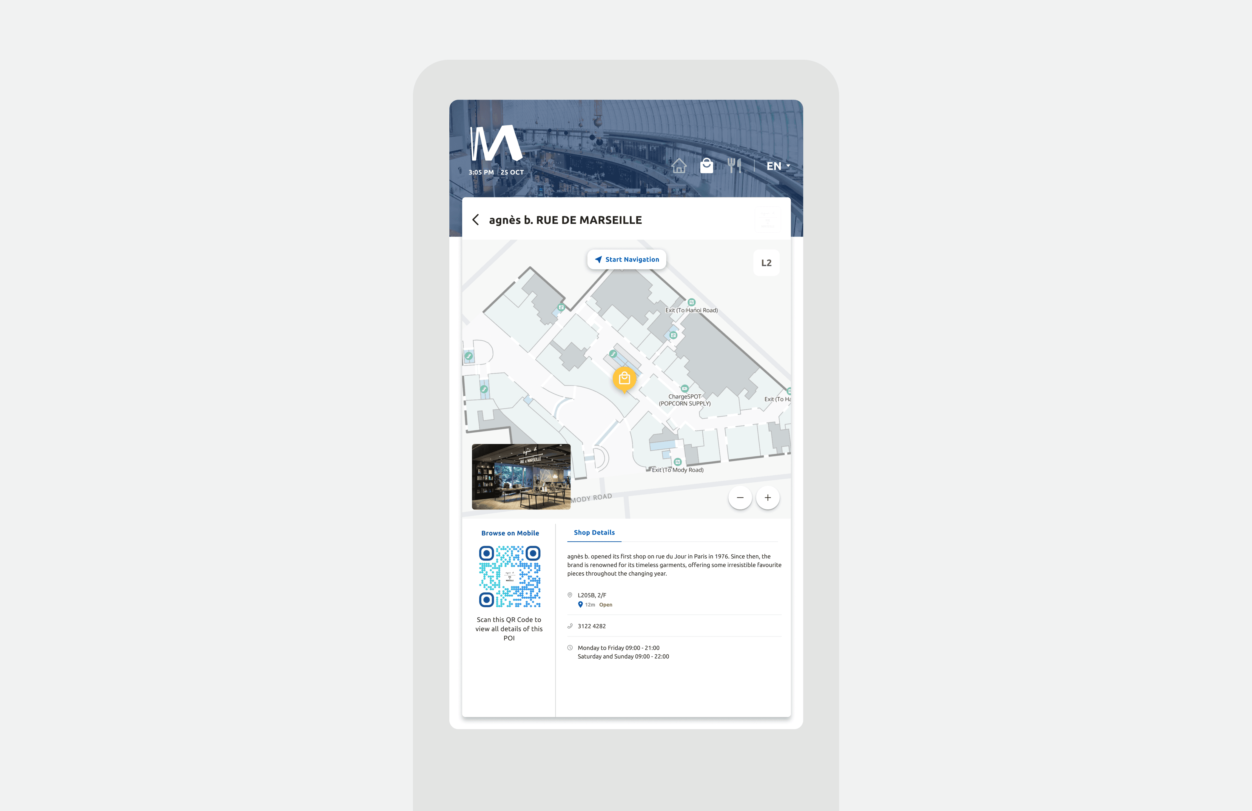
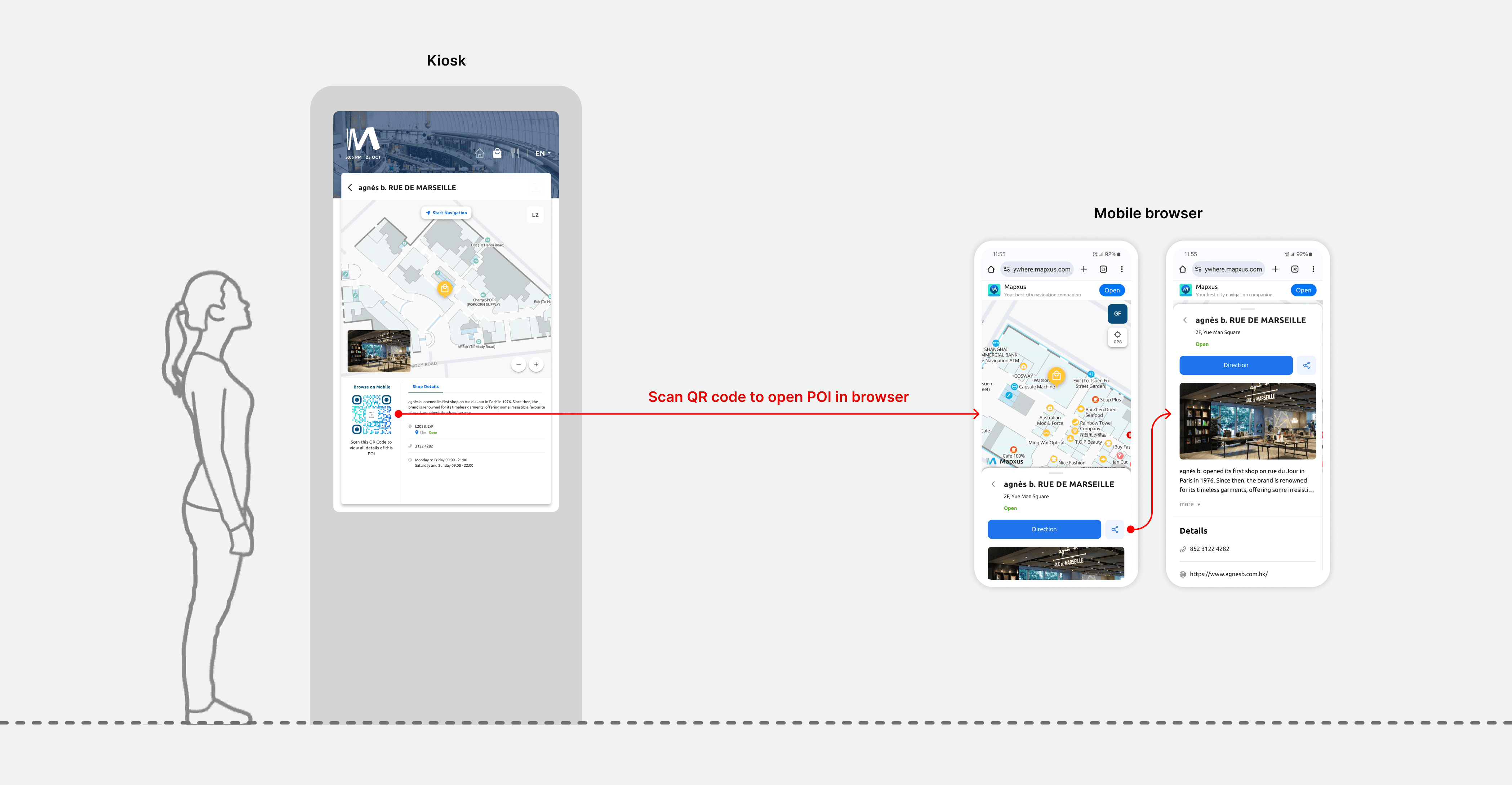
In this task, I was asked to refine the cross-platform experience across kiosks and mobiles - A QR code is added at the scanable position so that users can easily scan a QR code on the kiosk to access detailed POI information on their mobile device. Apart from the flow, I also prioritized the visual consistency across platforms.
3. Data visualisation board
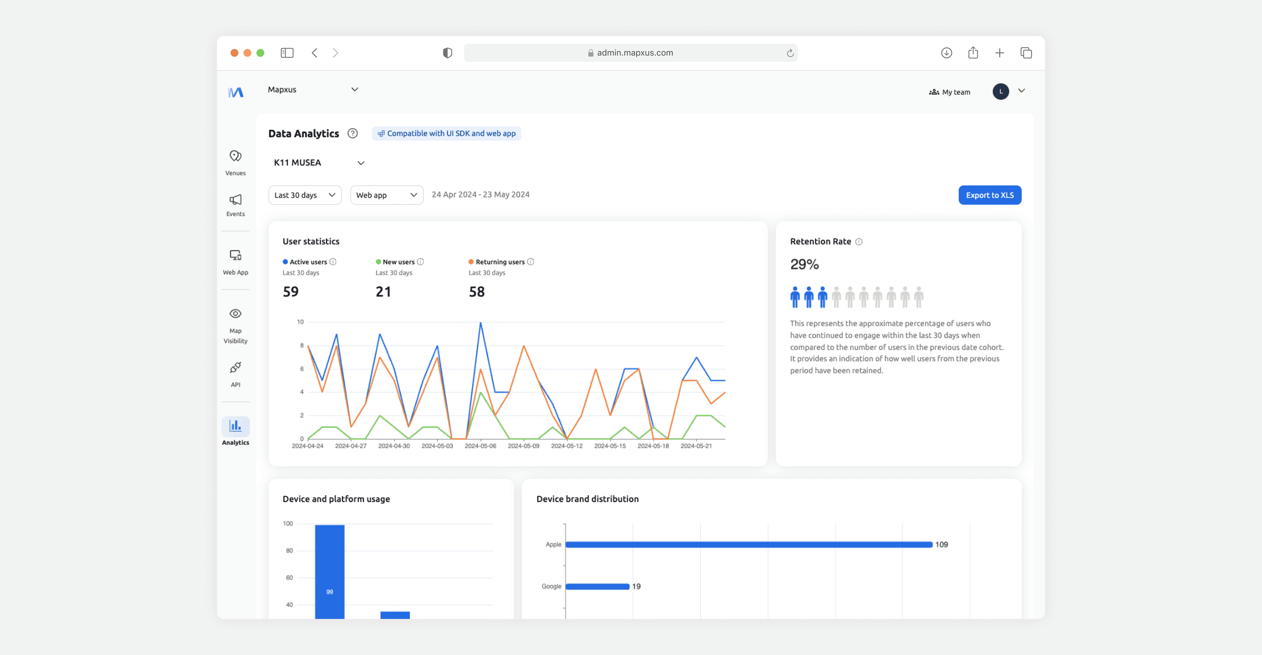
To provide venue owners a clear overview of user usage, I designed a data analytic board with 4 important data information and explored the visualisation of charts and numbers. This also involved close collaboration with the product manager, backend and frontend developers to ensure data availability.
4. iOS & Android app experience
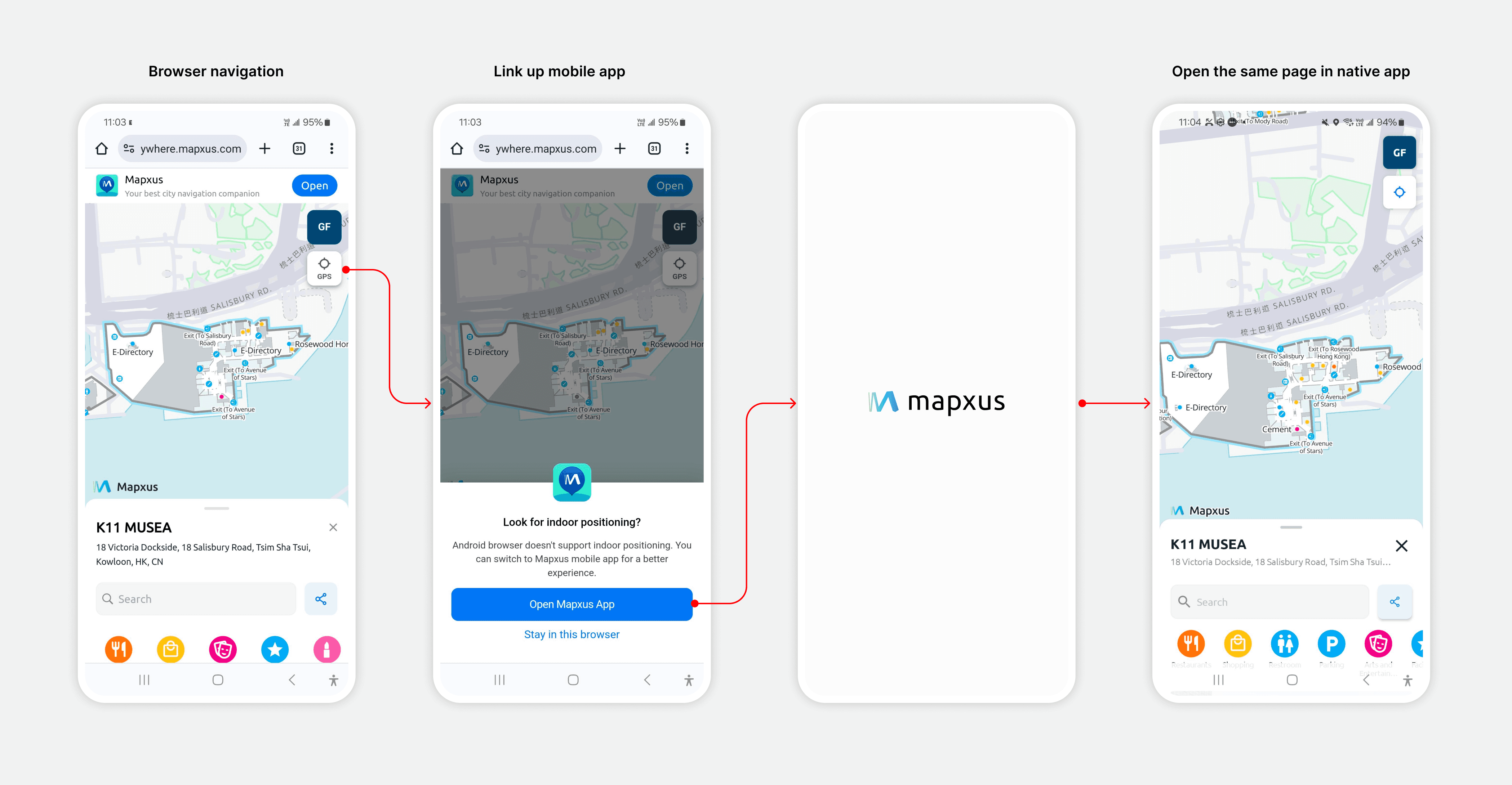
Due to the technical challenge of Android browsers, precise positioning will be unavailable and hence creating inconsistency experience with iOS users. To solve this, I designed a solution that uses a pop-up message with a redirect button to seamlessly bridge users from the browser to a native app, where precise positioning is possible.
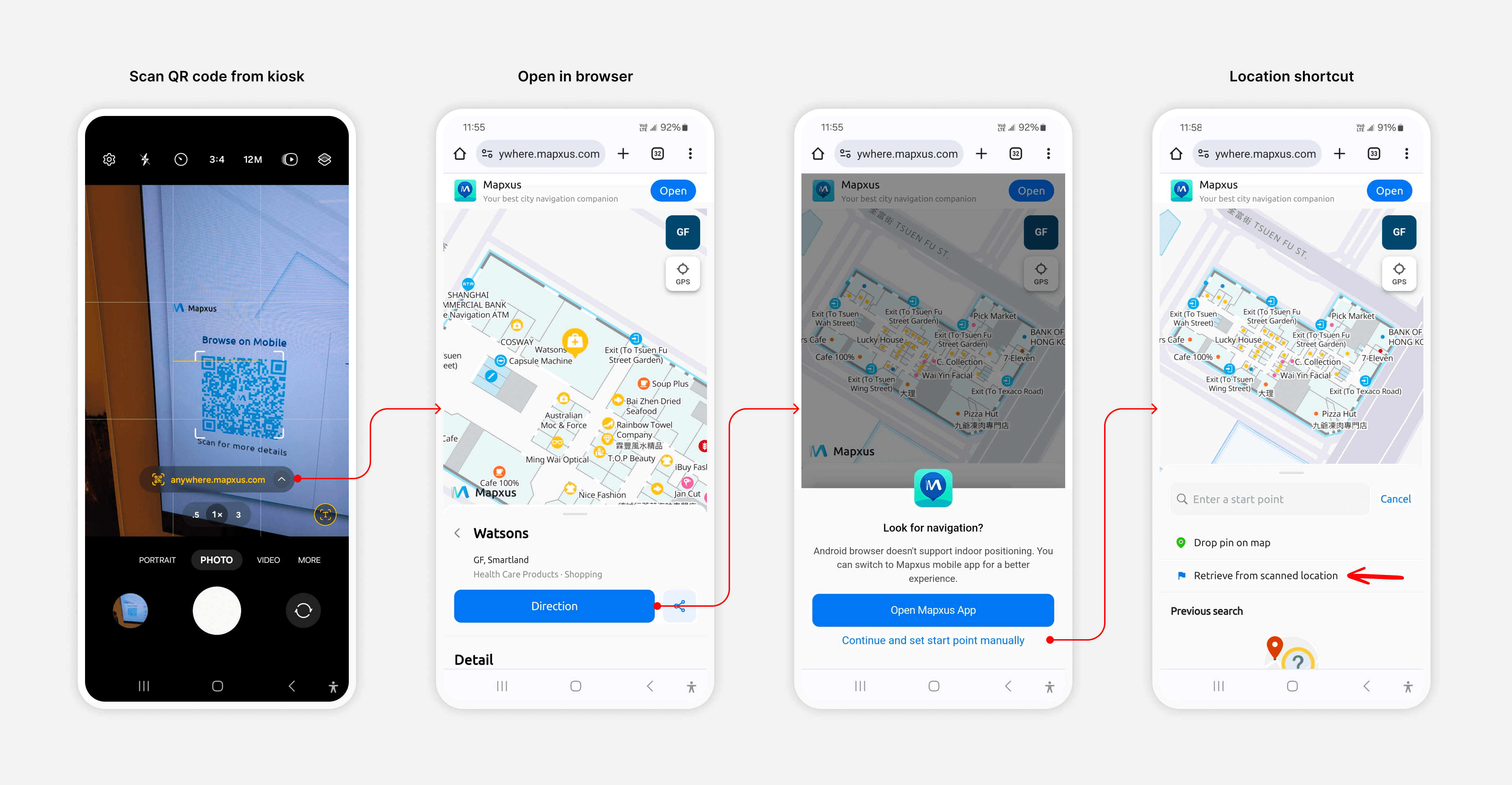
This solution was also extended to kiosks, allowing Android users to easily set the kiosk location as their starting point for navigation when scanning a kiosk-specific link.
Impact
The iterative design process allowed us to deliver the product quickly with balancing the user needs within a tight time frame. We moved quick and flexible for future improvements and even testing. We are proudly to present solutions to over 10 clients adopting it.
💡 Disclaimer: Please do not share or use any of the images included in this case study without obtaining prior permission from the appropriate parties, as they may be subject to copyright or other legal protections.
