SaaS | Usability testing
Onboarding redesign on HR management system
Onboarding redesign on HR management system
Work year
2023
Company
YOOV
Tool
Figma, Notion, Excel


Background
YOOV WORK is a comprehensive SaaS HR system used by HR managers and admins in medium to large-sized companies to automate HR workflows like attendance, rostering, leave, and payroll. However, the system's complexity led to low user retention and a heavy workload for the customer support team, who spent significant time, like 1-2 days per client, on setup assistance.
Design goals
So, our goal was to design a new self-service onboarding experience that would enable users to onboard independently and help them get started efficiently.
Process & Solutions
We collaborated with the customer support team to understand the essential setup steps. We then streamlined the onboarding flow, reducing 20+ steps across 6 modules to just 3 key steps in 2 modules.
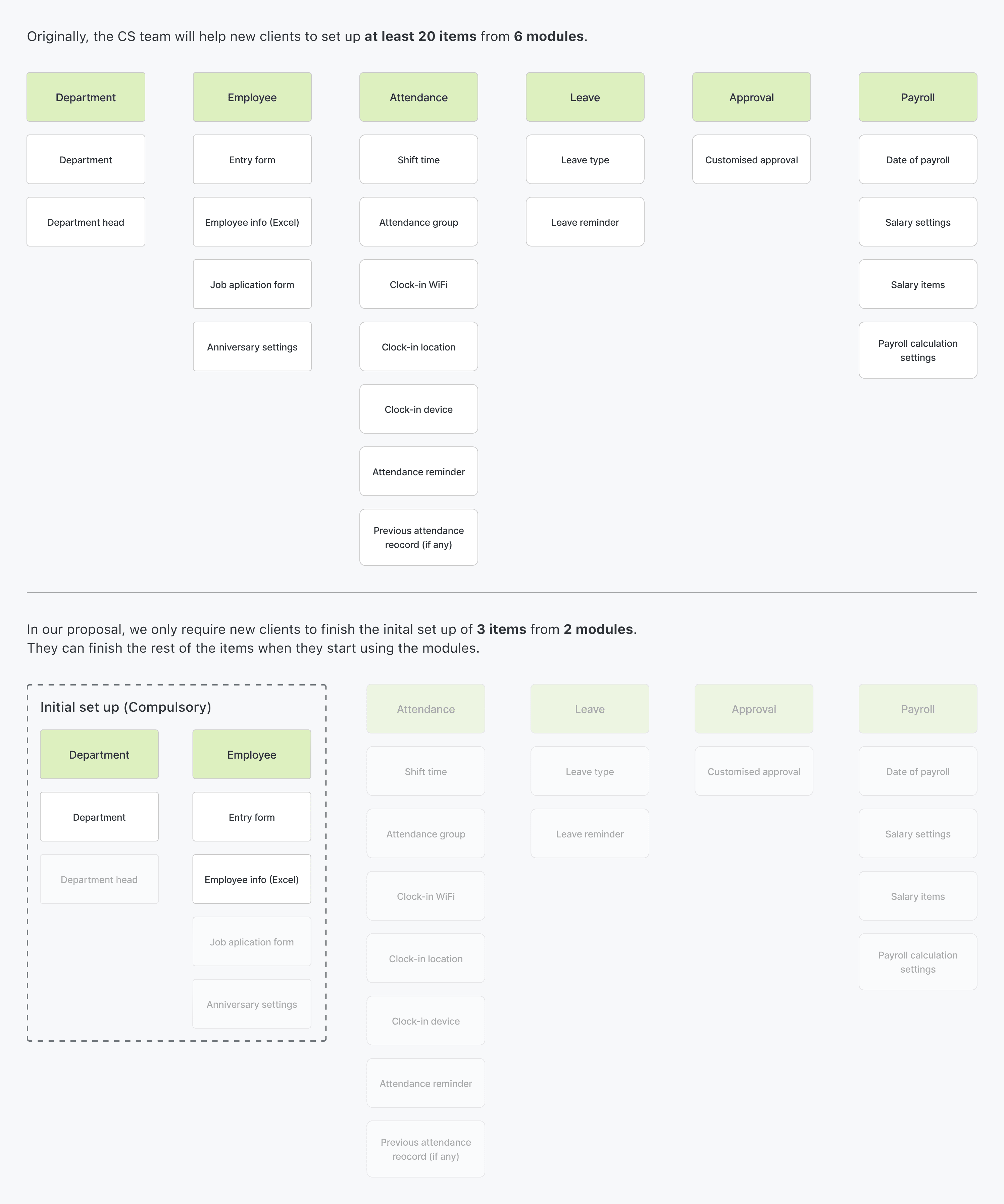
The new onboarding flow allows users to complete a basic setup first, then finishing the rest when they start using the modules. The key elements and mockups will be covered below.

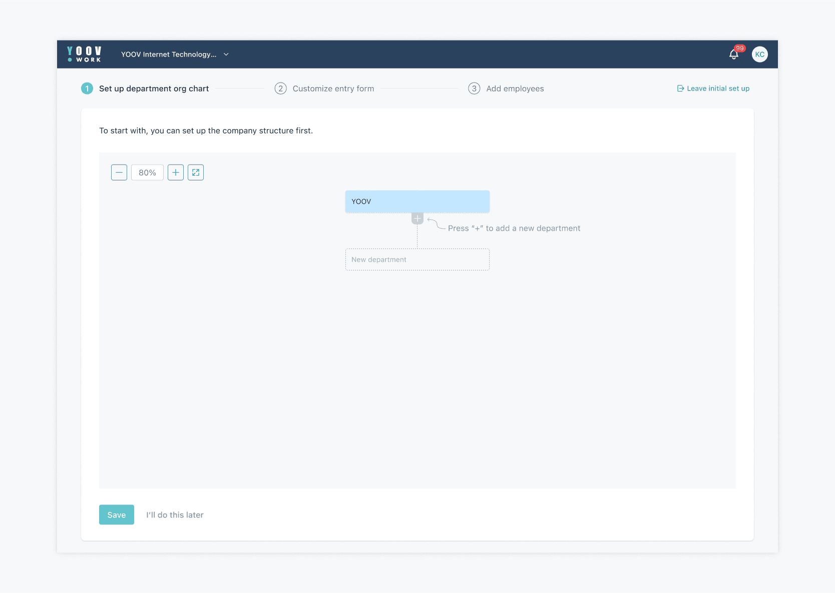
1. Basic set up
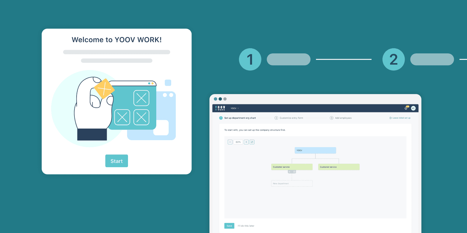
In the basic setup, only 3 essential steps are required. A step progress indicator is at the top for users to preview the upcoming actions.
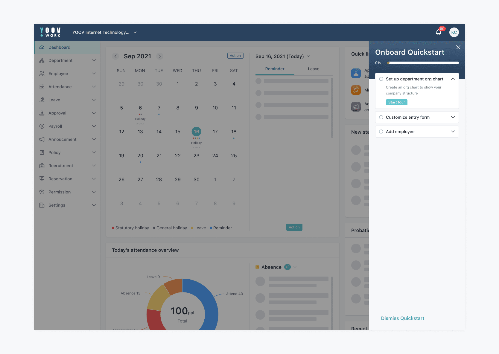
2. Quick start guide
When users skip or didn't complete the initial set up, we provide them an access to continue.
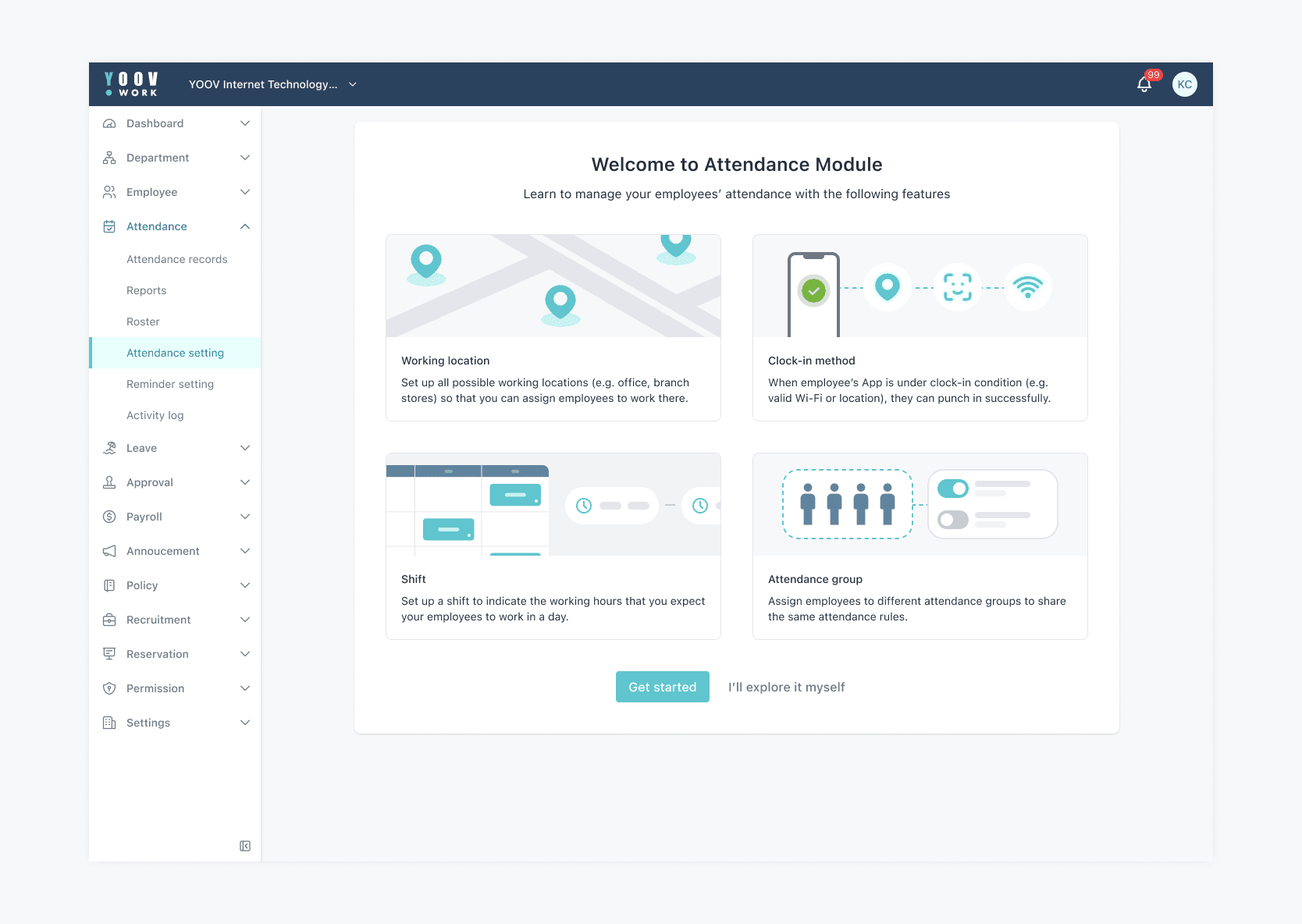
3. Module introduction
When users enter the module for the first time, there is an introduction page about the key features and functionalities of module. I tailored the graphics for every module.
4. In-Module walkthrough
When users start the module tutorial, there are hotspots to guide users through the key features.
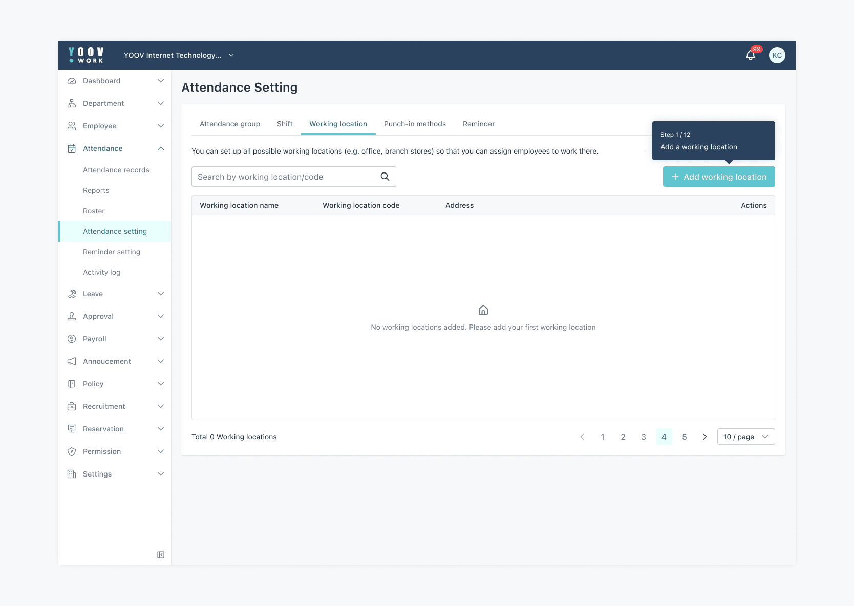
5. Information hints
When there is a long form, there are hints to guide users to fill in by explaining jargons and provide more setting information.
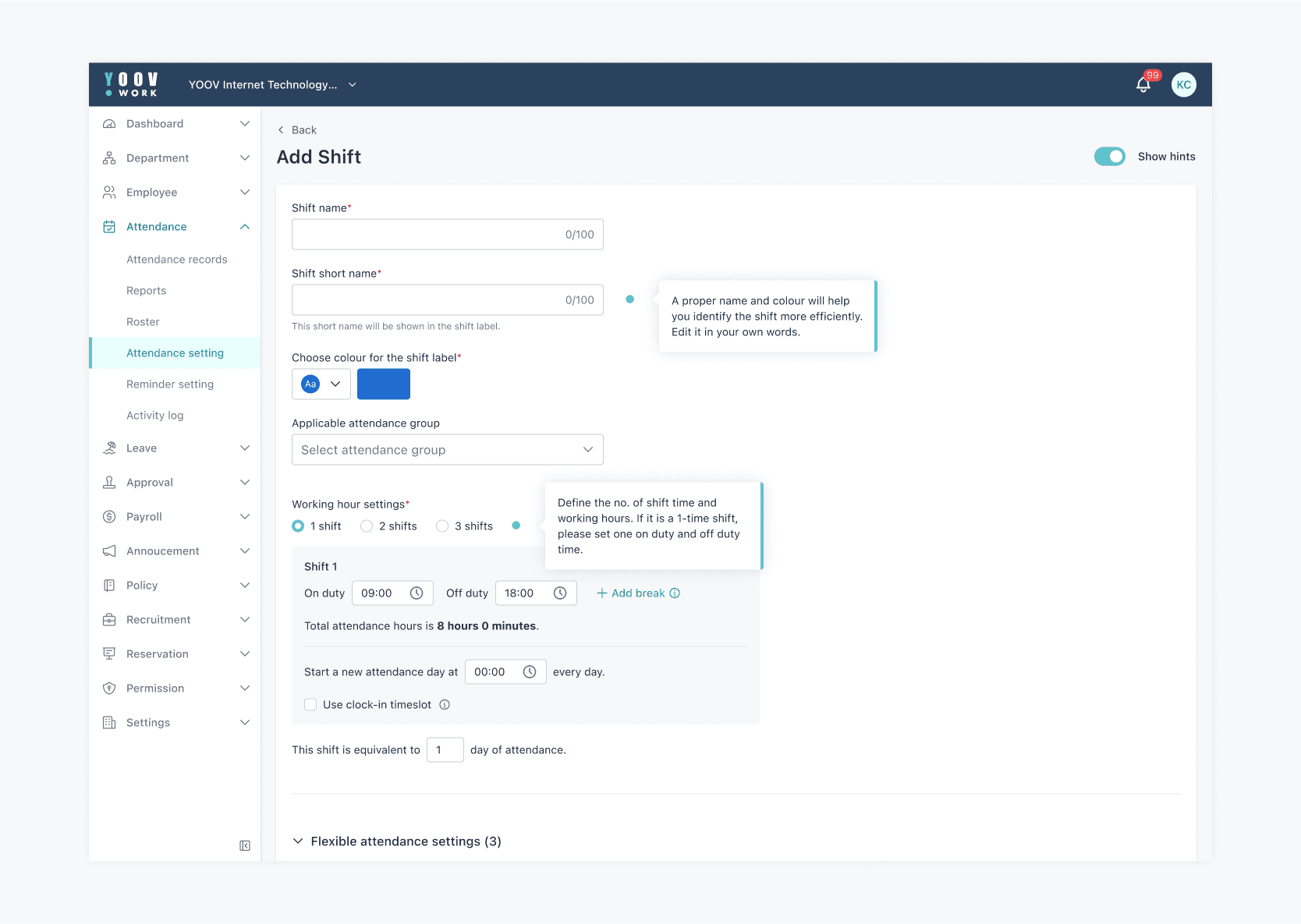
Next step: Usability testing & Results
After redesigning, we conducted moderated, in-person usability testing with 5 internal participants representing our target users. Results are shown below.
-> Task success rate: 95.4%
-> Average completion time: 15 mins
The results were highly positive, and we used the feedback gathered for further analysis and improvements. The entire design and testing process took 4 months, including research, design, usability testing, analysis, and design enhancement.
Usability testing process
We began with 2 rounds of pilot testing using our Figma prototype to refine the test plan. We then recruited 5 internal participants representing our target user group and guided them through 13 tasks.
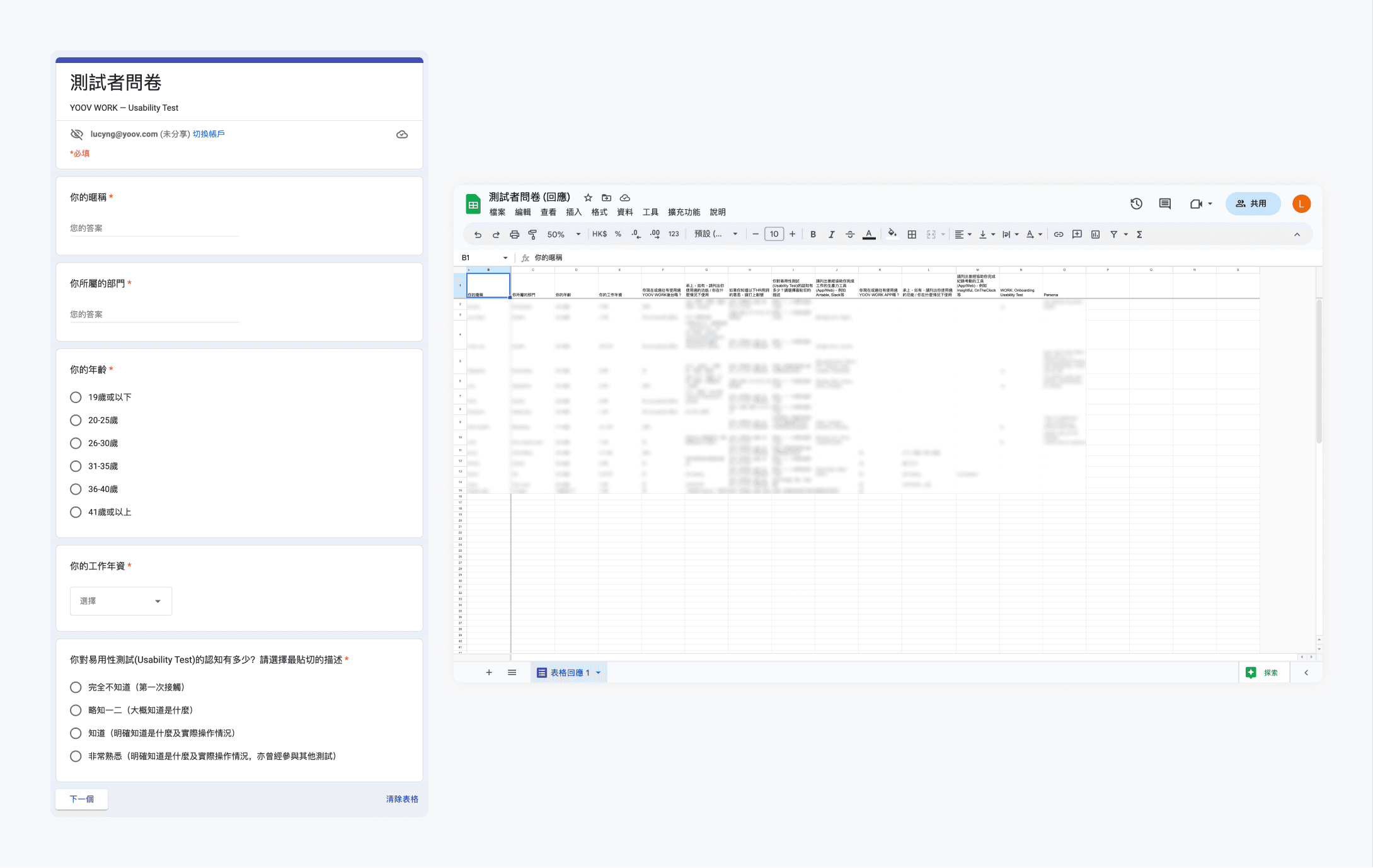
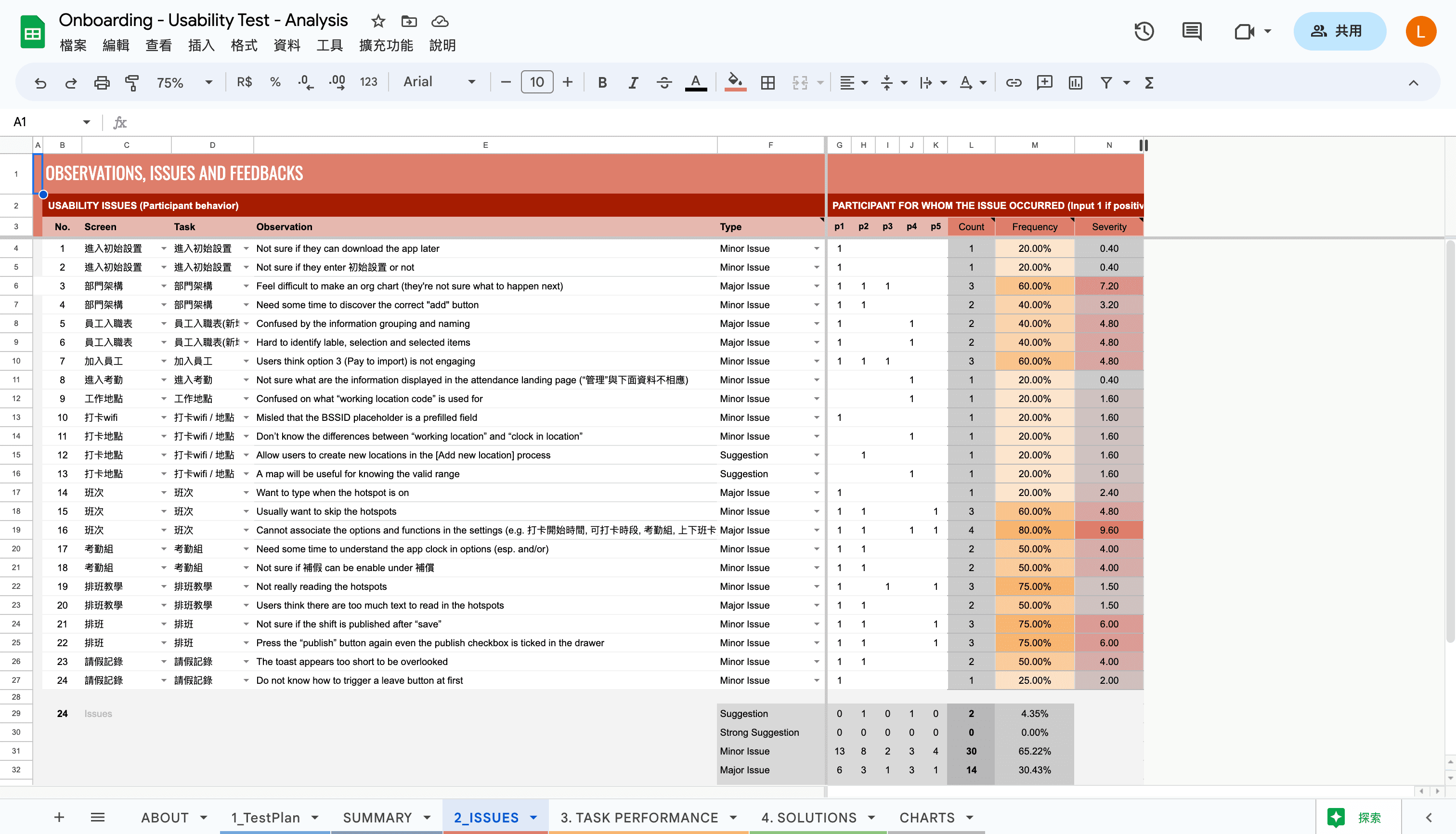
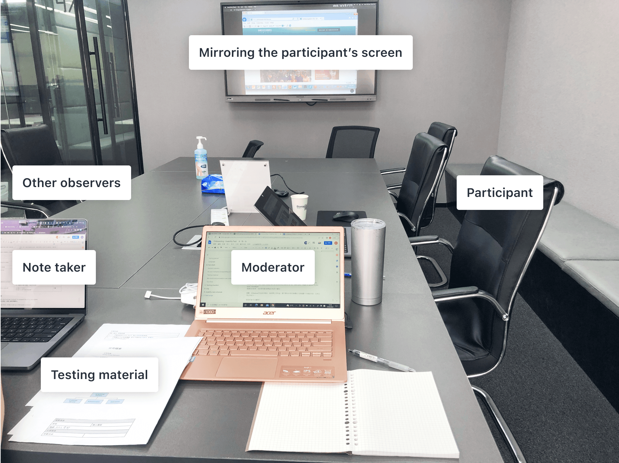
We set up the environment as below. During the sessions, I acted as the moderator, facilitating the interaction between the participants and the design. My co-worker helped to record the sessions, tracked completion times and jot down observations in a Google Sheet.
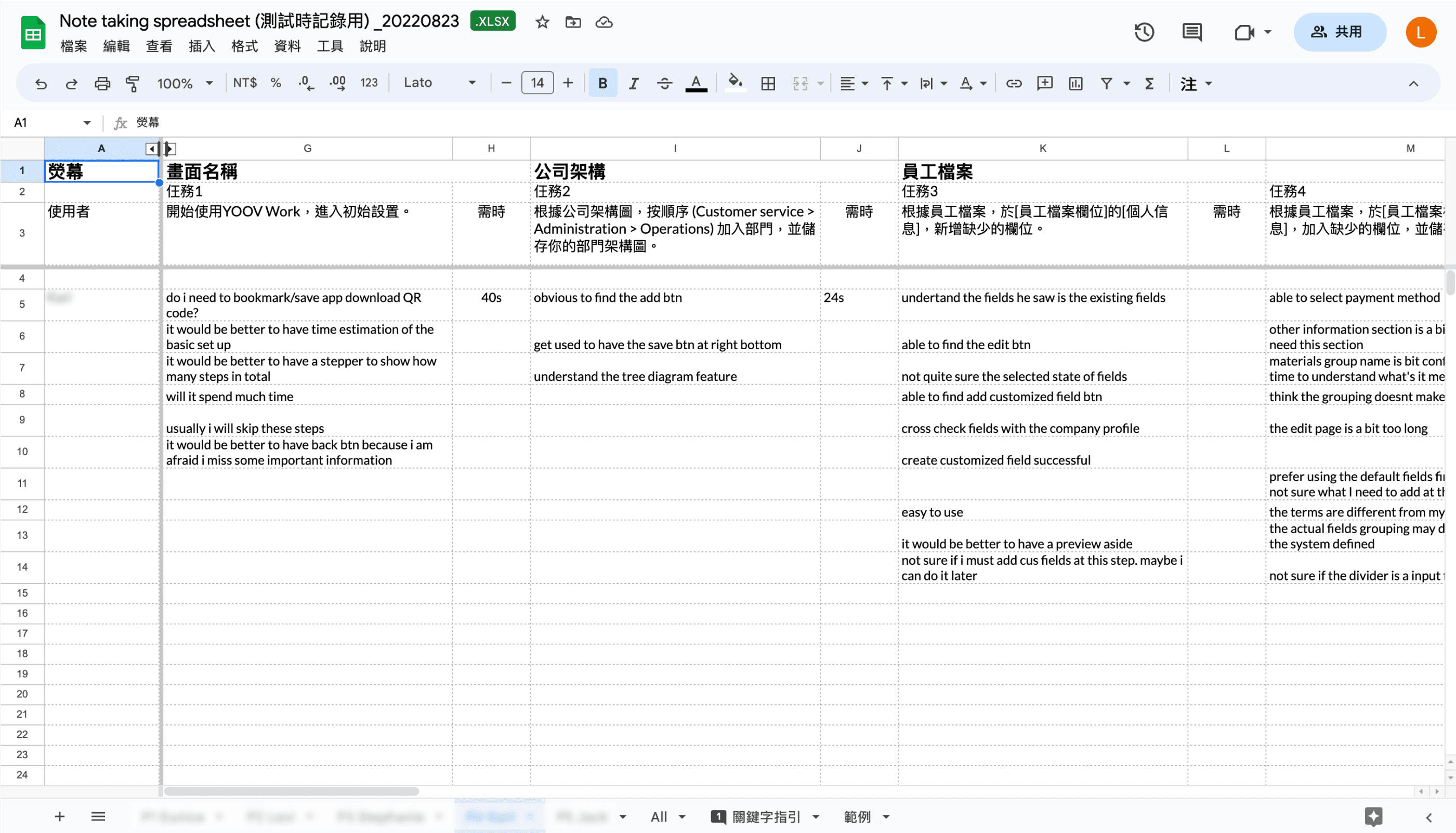
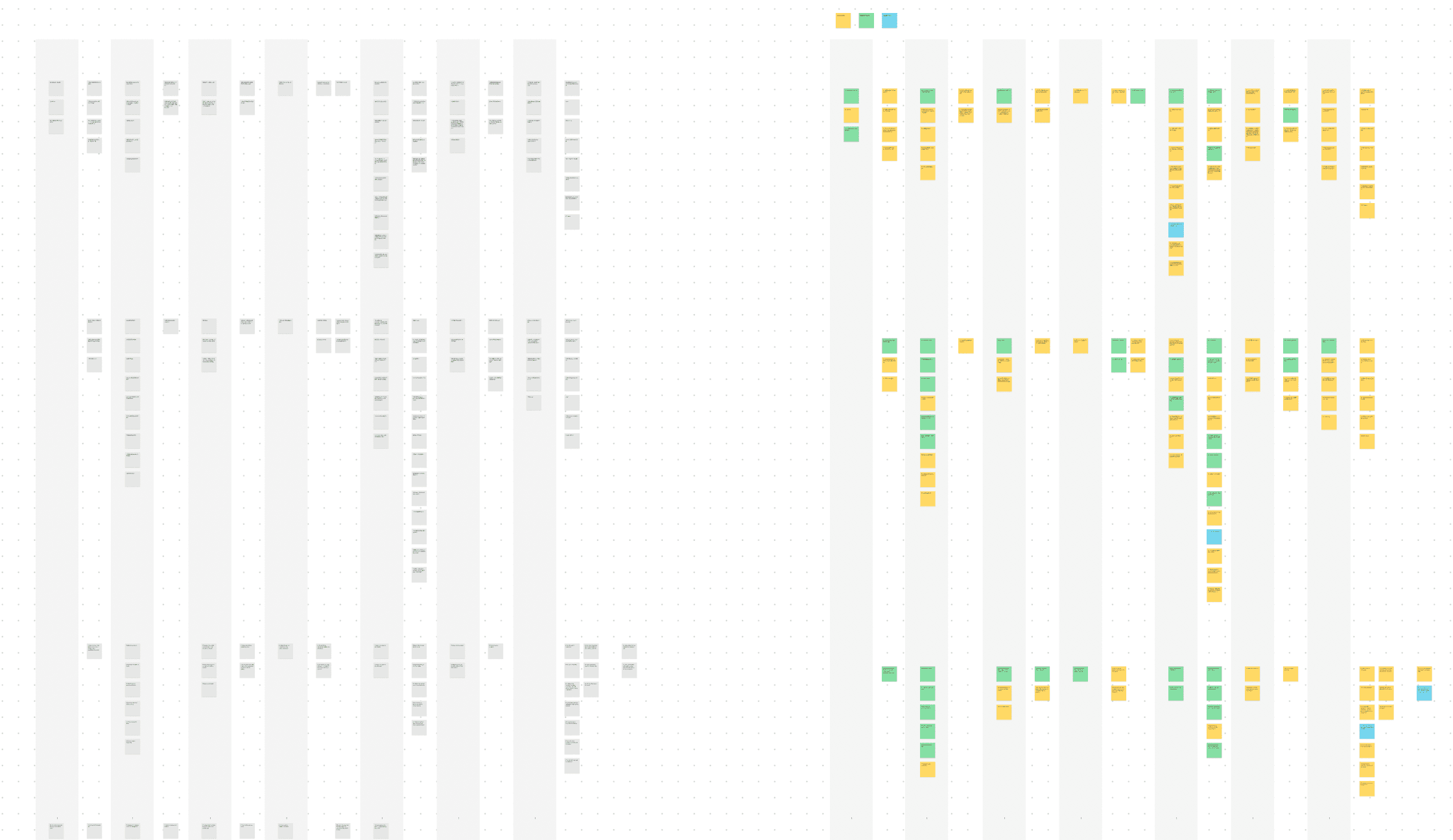
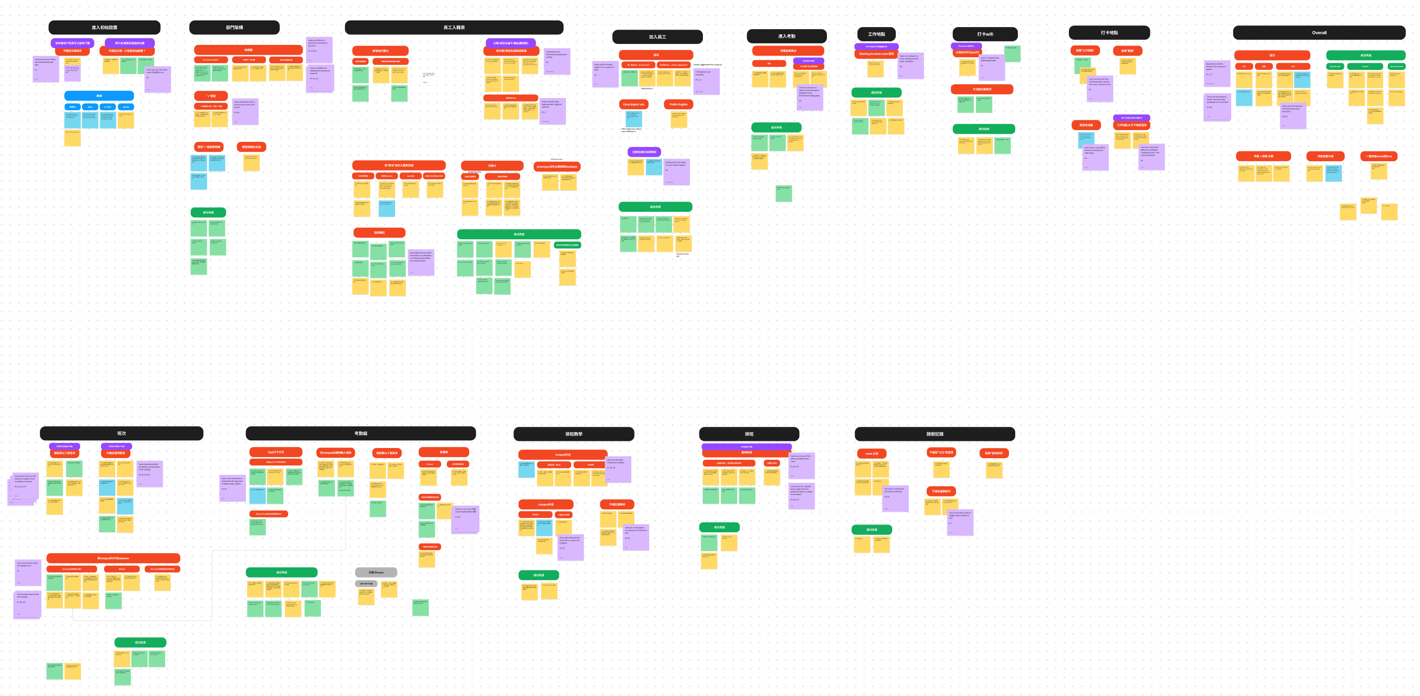
After that, we analyzed the results using an affinity diagram, identifying key pain points and prioritize design improvements. Finally, we created a usability testing framework (including test outlines, flows, checklists, and scripts) for future internal use.


Background
YOOV WORK is a comprehensive SaaS HR system used by HR managers and admins in medium to large-sized companies to automate HR workflows like attendance, rostering, leave, and payroll. However, the system's complexity led to low user retention and a heavy workload for the customer support team, who spent significant time, like 1-2 days per client, on setup assistance.
Design goals
So, our goal was to design a new self-service onboarding experience that would enable users to onboard independently and help them get started efficiently.
Process & Solutions
We collaborated with the customer support team to understand the essential setup steps. We then streamlined the onboarding flow, reducing 20+ steps across 6 modules to just 3 key steps in 2 modules.

The new onboarding flow allows users to complete a basic setup first, then finishing the rest when they start using the modules. The key elements and mockups will be covered below.

1. Basic set up
In the basic setup, only 3 essential steps are required. A step progress indicator is at the top for users to preview the upcoming actions.

2. Quick start guide
When users skip or didn't complete the initial set up, we provide them an access to continue.

3. Module introduction
When users enter the module for the first time, there is an introduction page about the key features and functionalities of module. I tailored the graphics for every module.

4. In-Module walkthrough
When users start the module tutorial, there are hotspots to guide users through the key features.

5. Information hints
When there is a long form, there are hints to guide users to fill in by explaining jargons and provide more setting information.

Next step: Usability testing & Results
After redesigning, we conducted moderated, in-person usability testing with 5 internal participants representing our target users. Results are shown below.
-> Task success rate: 95.4%
-> Average completion time: 15 mins
The results were highly positive, and we used the feedback gathered for further analysis and improvements. The entire design and testing process took 4 months, including research, design, usability testing, analysis, and design enhancement.
Usability testing process
We began with 2 rounds of pilot testing using our Figma prototype to refine the test plan. We then recruited 5 internal participants representing our target user group and guided them through 13 tasks.

We set up the environment as below. During the sessions, I acted as the moderator, facilitating the interaction between the participants and the design. My co-worker helped to record the sessions, tracked completion times and jot down observations in a Google Sheet.


After that, we analyzed the results using an affinity diagram, identifying key pain points and prioritize design improvements. Finally, we created a usability testing framework (including test outlines, flows, checklists, and scripts) for future internal use.
