Mobile app | User research | WCGA Accessibility
Accessibility and Inclusivity: A navigation app for vision-impaired individuals
Accessibility and Inclusivity: A navigation app for vision-impaired individuals
Work year
2024
Company
Mapxus
Tool
Figma, Dovetail, Lottie


Background
In 2023, we partnered with a local non-profit organisation to enhance a navigation app for the visually impaired users. The project is committed to inclusive and accessible design solutions. As being the sole designer of this project, let me share more about how research guided our design journey.
Empathy-driven research

To understand the needs of visually impaired users, we dedicated 1-2 months to user-centric research. The research includes:
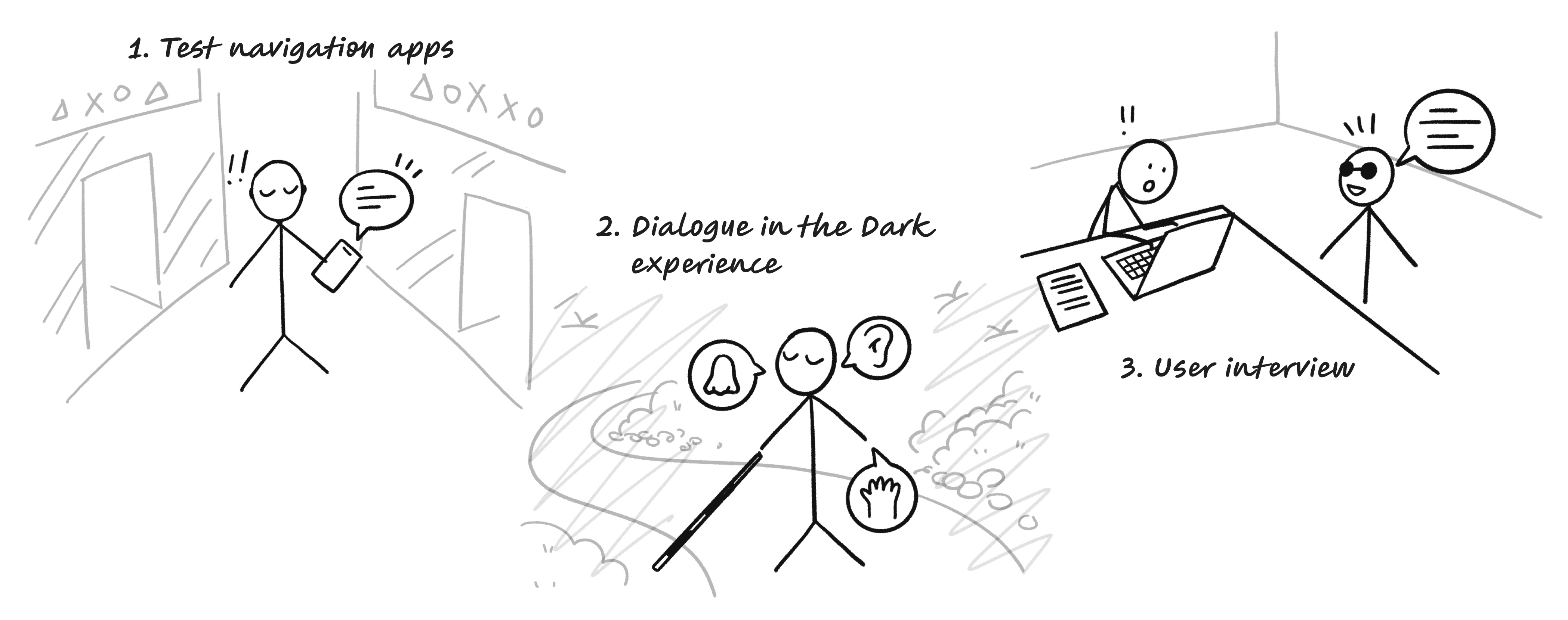
1. Testing navigation apps
We explored the challenges of navigating indoor venues by using device screen reader function (VoiceOver on iOS) and closing our eyes. This gave us firsthand experience of the spatial difficulties without sight.
2. Dialogue in the dark
We also attended a "Dialogue in the dark", which is a guided experience in a complete darkness. It allowed us understand the reliance on our senses other than sight, like touch and hearing, and deepened our understand to the everyday challenges faced by blind individuals.
3. User interviews
We interviewed 4 visually impaired people to reveal their adaptability and openness to assistive technology. The observation of their use and thoughts on accessibility features provided us valuable insights for our design.
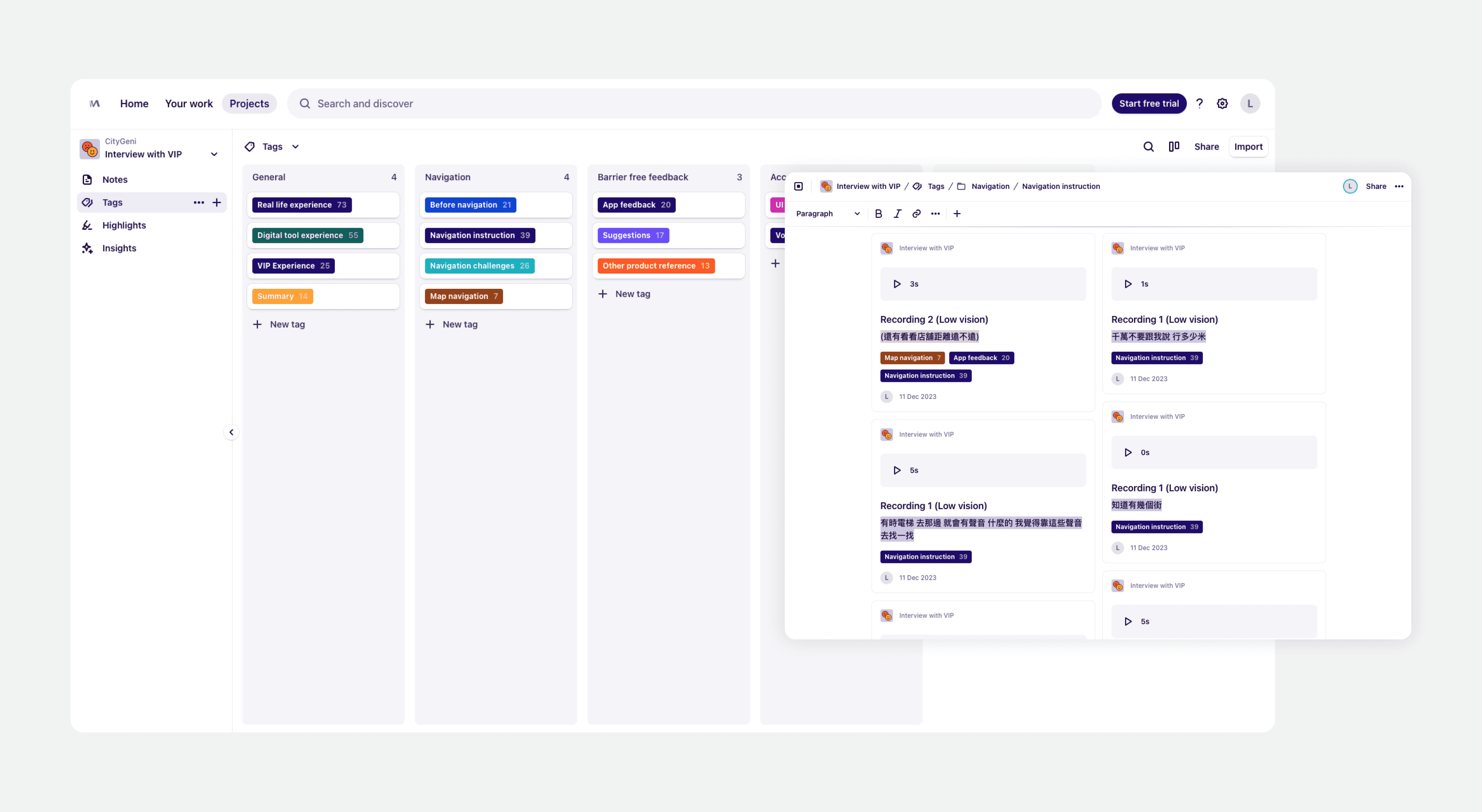
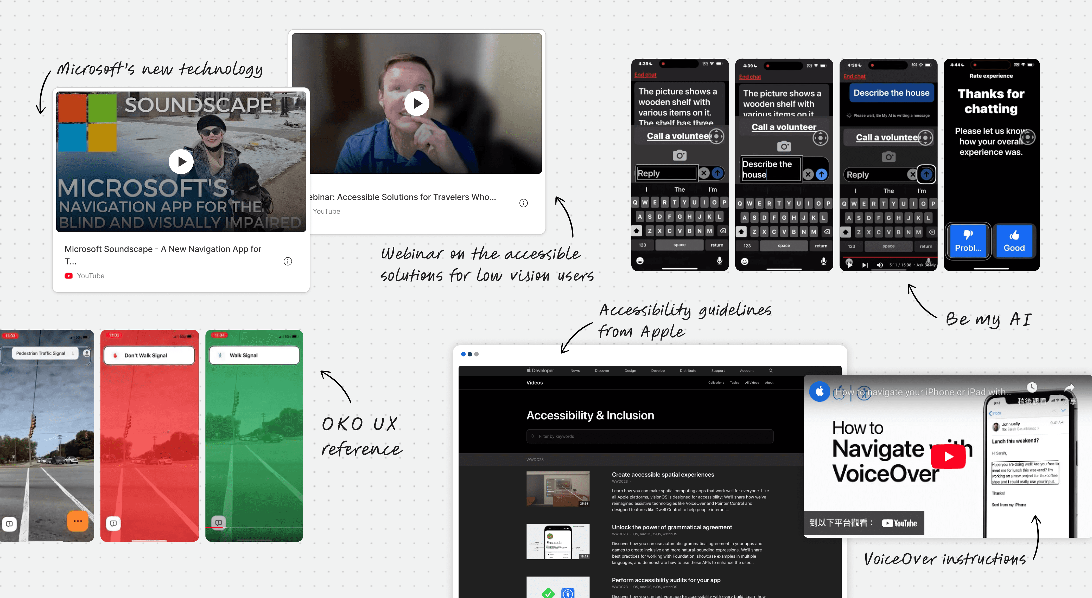
To document our findings, we used tools like Dovetail for analysis and Figma for wireframe exploration. We also referenced accessibility guidelines from Apple, Microsoft and The Blind Life.
Key features designed
After consolidating the research, we shaped these 3 main features for the app.
Feature 1: Accessible content & UX Copy writing
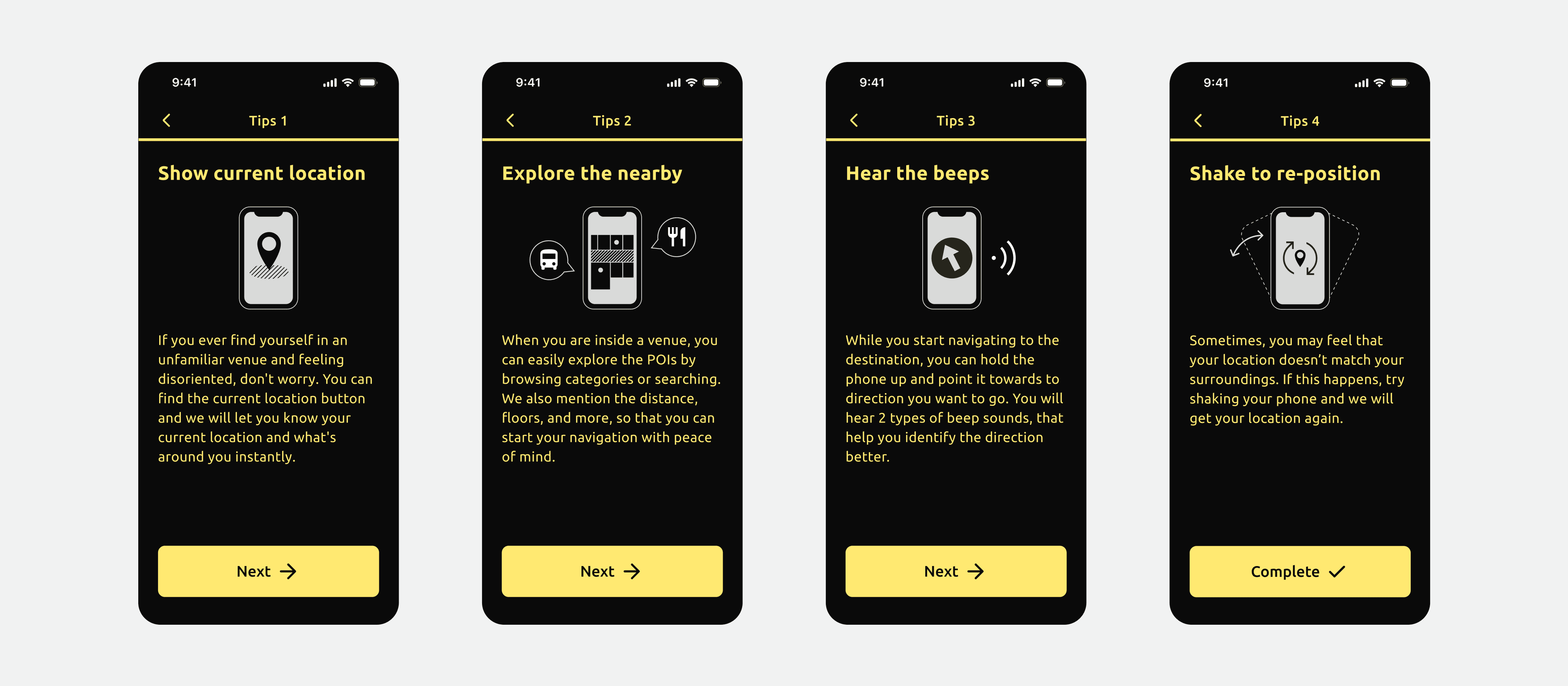
We crafted clearer and more descriptive copy for better context and reassurance.
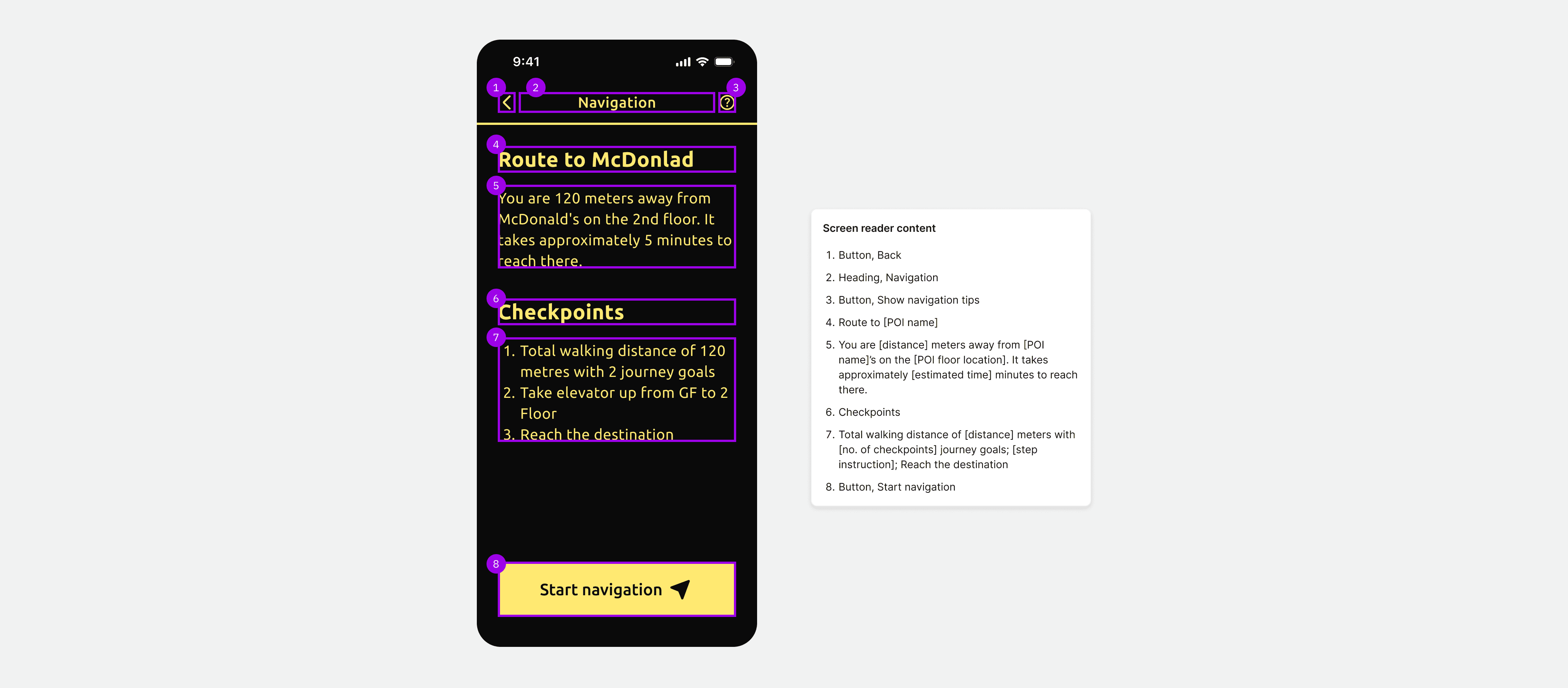
We also optimized the layout and content for seamless navigation across the screen reader order.
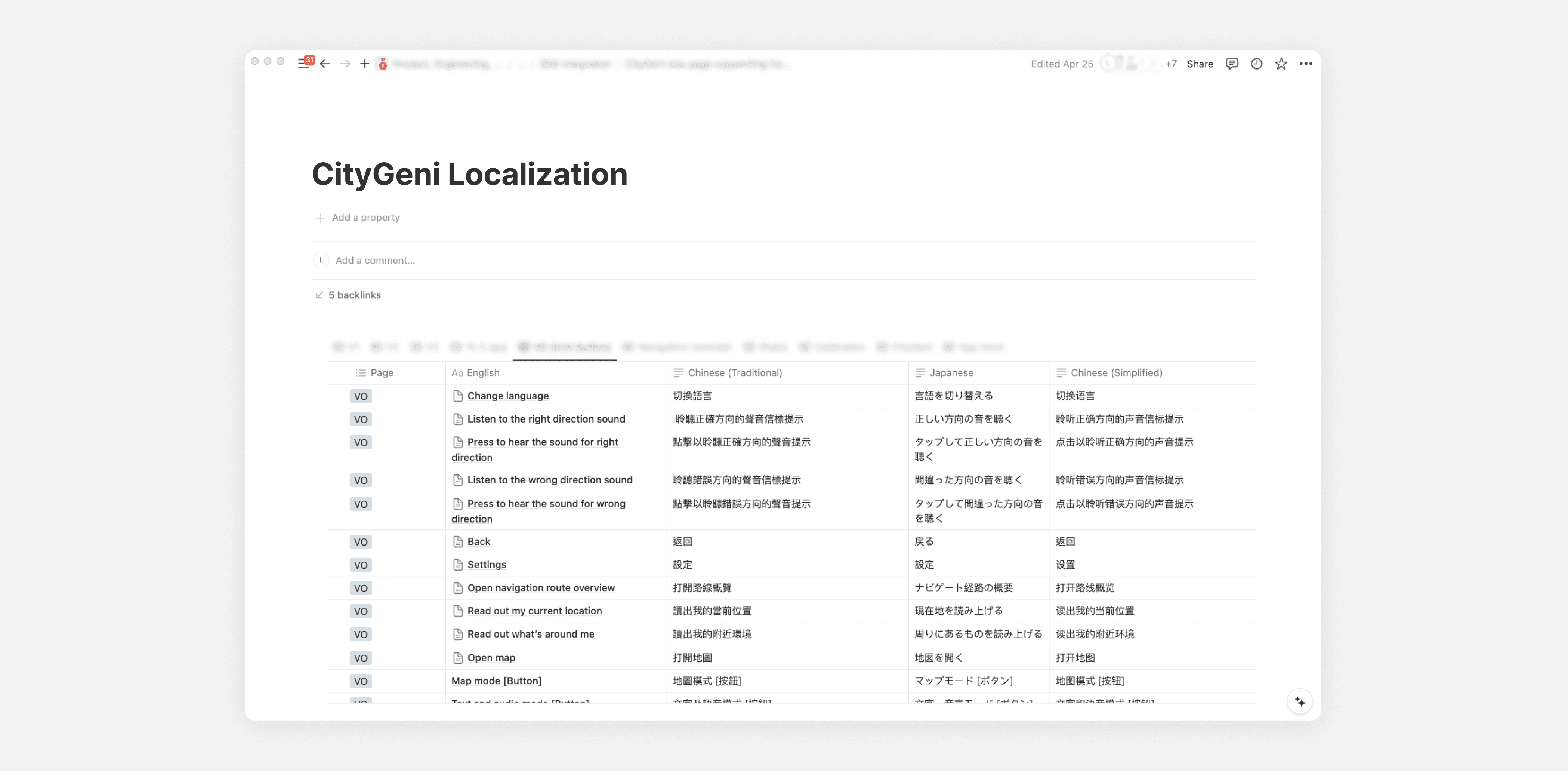
When the design is ready, we localised the content into Chinese and Japanese for international users.
Feature 2: Improve UI visual hierarchy
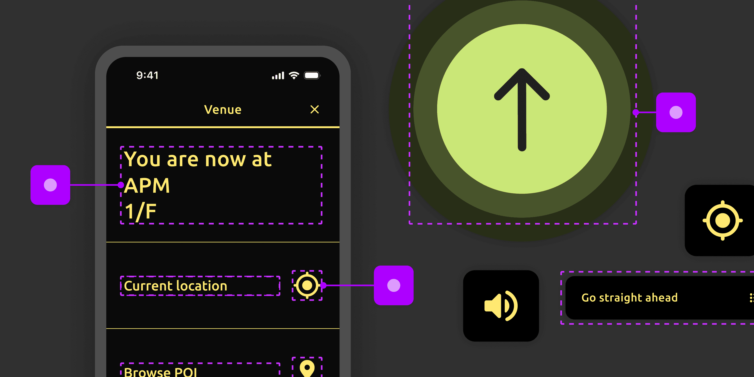
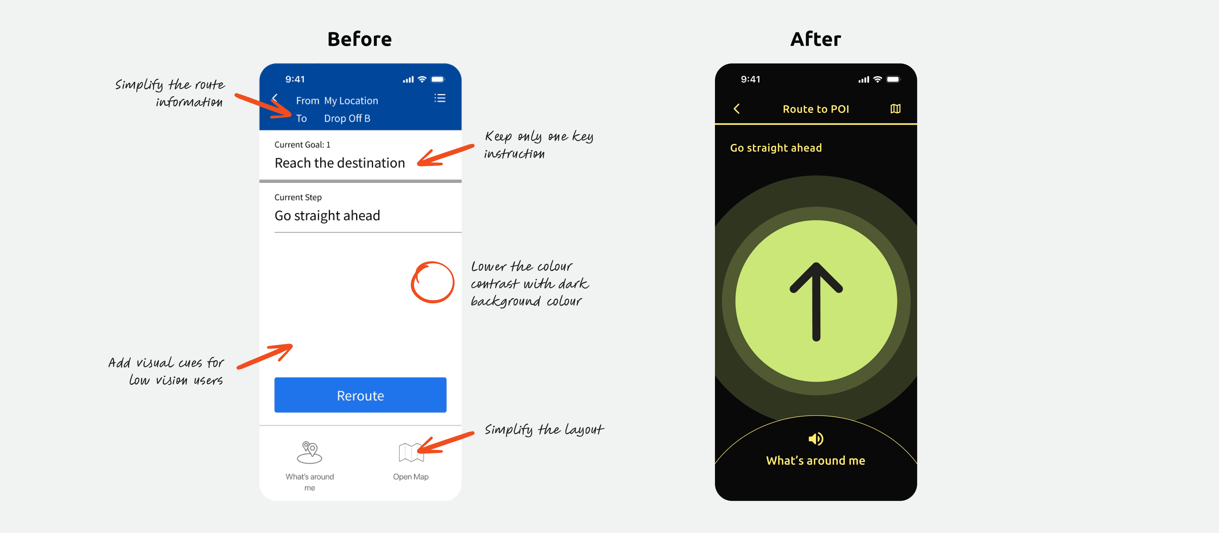
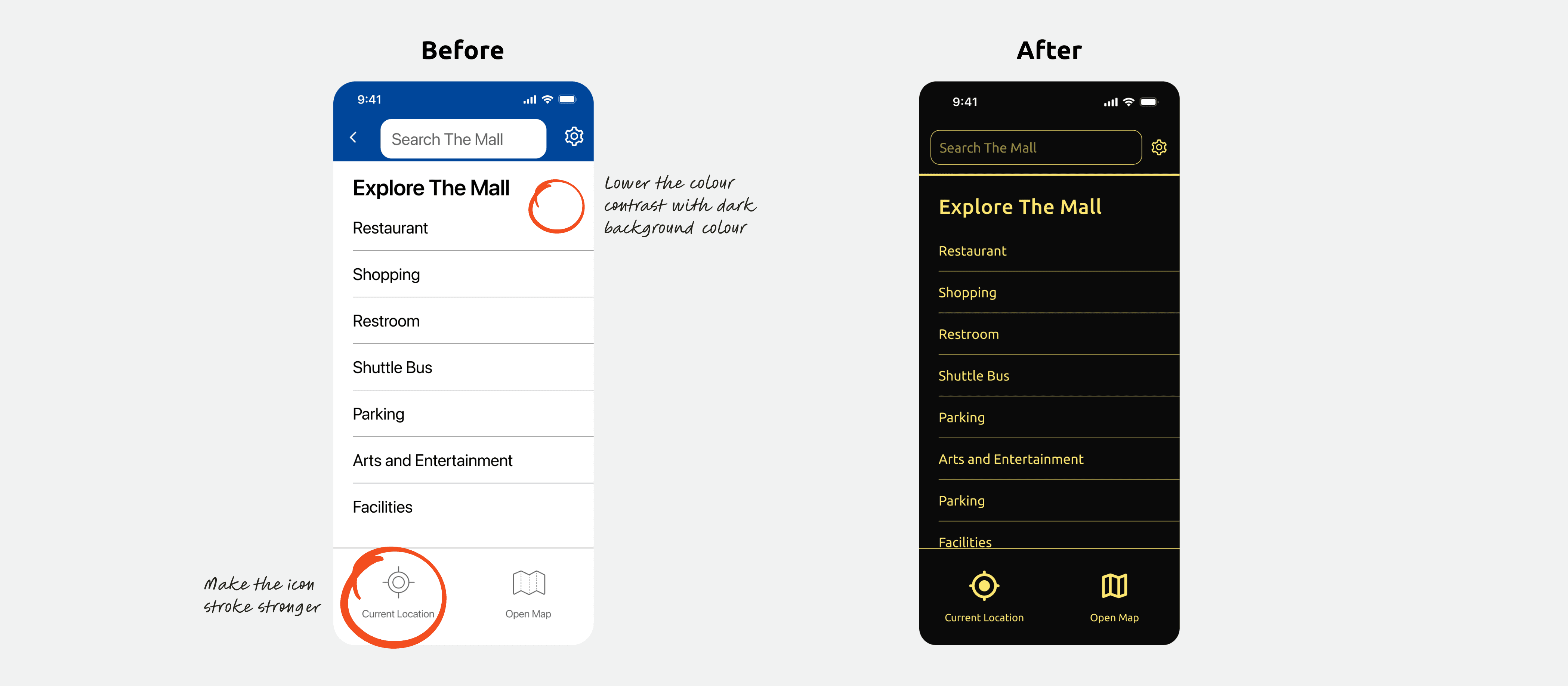
Grounded by accessibility guidelines and observation, we introduced larger text, high-contrast layouts (black VS yellow), left aligned content and clear icons for better usability.
Feature 3: Animated directional icon
We also explored the feasibility of motion within the app and enhanced the synchronized audio-visual feature with an animated directional arrow. This helps to reduce cognitive load and improve navigation clarity for the users.


Outcome
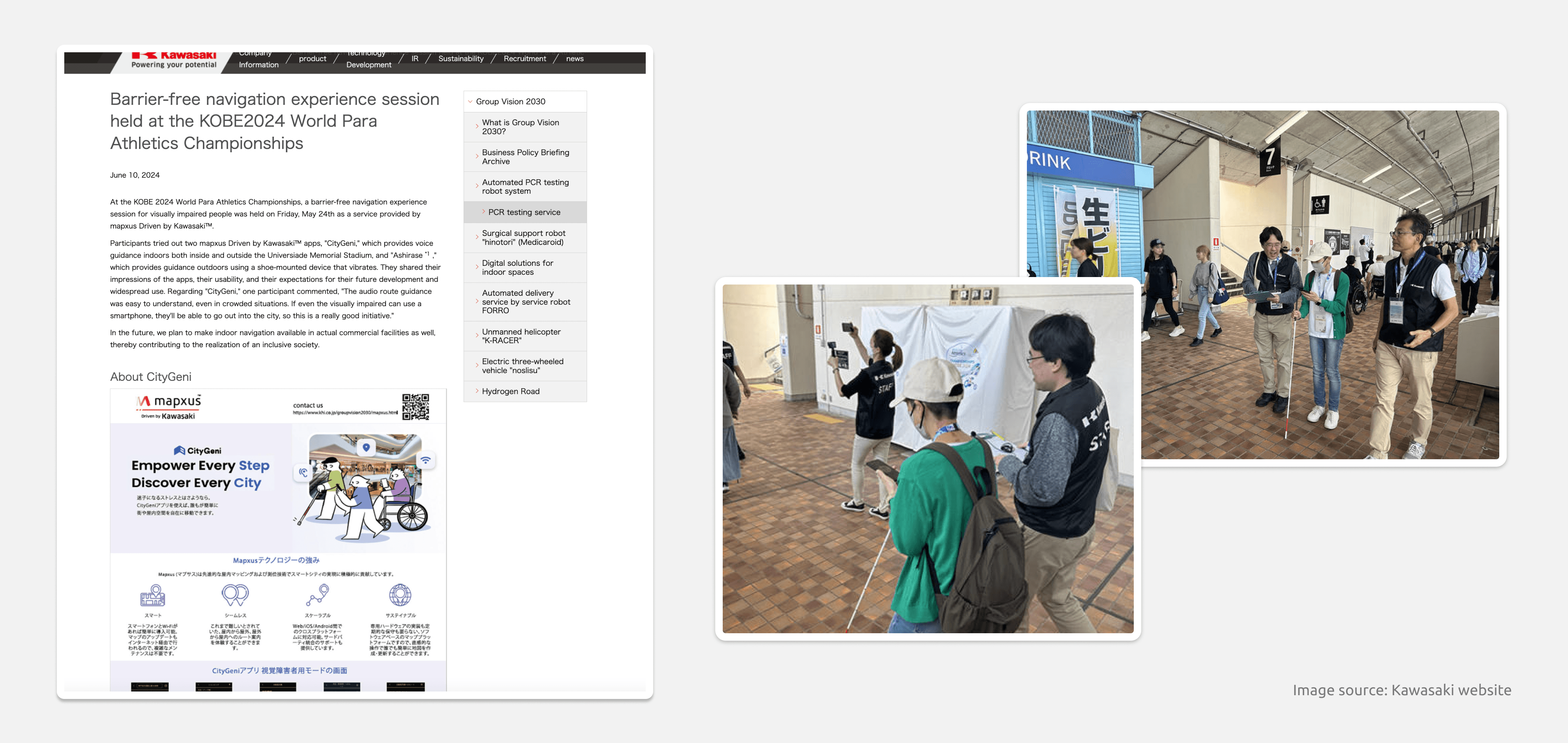
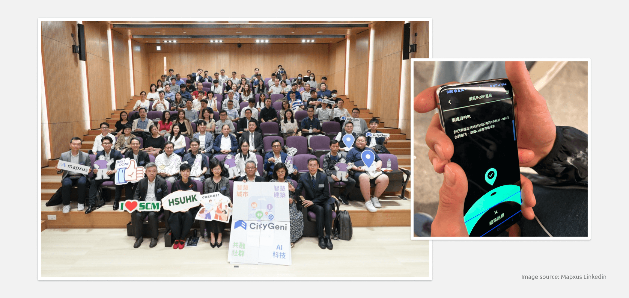
The app was initially deployed at a major sports event in Japan, and has been awarded the HKICT Smart Mobility (Smart Tourism) Gold Award 2024 for its application on barrier-free navigation. I am happy to be part of the team of this accomplishment and am excited about its continued growth in future.
If you're interested to try, please download it from App store or Google play.
Background
In 2023, we partnered with a local non-profit organisation to enhance a navigation app for the visually impaired users. The project is committed to inclusive and accessible design solutions. As being the sole designer of this project, let me share more about how research guided our design journey.
Empathy-driven research

To understand the needs of visually impaired users, we dedicated 1-2 months to user-centric research. The research includes:
1. Testing navigation apps
We explored the challenges of navigating indoor venues by using device screen reader function (VoiceOver on iOS) and closing our eyes. This gave us firsthand experience of the spatial difficulties without sight.
2. Dialogue in the dark
We also attended a "Dialogue in the dark", which is a guided experience in a complete darkness. It allowed us understand the reliance on our senses other than sight, like touch and hearing, and deepened our understand to the everyday challenges faced by blind individuals.
3. User interviews
We interviewed 4 visually impaired people to reveal their adaptability and openness to assistive technology. The observation of their use and thoughts on accessibility features provided us valuable insights for our design.

To document our findings, we used tools like Dovetail for analysis and Figma for wireframe exploration. We also referenced accessibility guidelines from Apple, Microsoft and The Blind Life.


Key features designed
After consolidating the research, we shaped these 3 main features for the app.
Feature 1: Accessible content & UX Copy writing
We crafted clearer and more descriptive copy for better context and reassurance.

We also optimized the layout and content for seamless navigation across the screen reader order.

When the design is ready, we localised the content into Chinese and Japanese for international users.

Feature 2: Improve UI visual hierarchy
Grounded by accessibility guidelines and observation, we introduced larger text, high-contrast layouts (black VS yellow), left aligned content and clear icons for better usability.


Feature 3: Animated directional icon
We also explored the feasibility of motion within the app and enhanced the synchronized audio-visual feature with an animated directional arrow. This helps to reduce cognitive load and improve navigation clarity for the users.


Outcome
The app was initially deployed at a major sports event in Japan, and has been awarded the HKICT Smart Mobility (Smart Tourism) Gold Award 2024 for its application on barrier-free navigation. I am happy to be part of the team of this accomplishment and am excited about its continued growth in future.


If you're interested to try, please download it from App store or Google play.